Analysis of a Graphic Branding Package

I have been fascinated with brand identity for as long as I can remember. I think it’s amazing how components such as color scheme, typography, and graphics are capable of completely defining a company’s image. Some of my fondest memories growing up as a child were watching Cartoon Network bumpers that emphasized characters from shows the network would air and used a reinforced “checkerboard” motif that complimented the network’s logo. Even today I find myself captivated by brand identities from companies spanning all sorts of different industries. (NBC, USA Today, and Wendy’s come to mind.) It’s an interest that I have never grown tired of and has only cultivated more over the years…so when I was assigned to create an animated graphics package of my own for my motion design class, I was ecstatic.

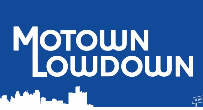
The first thing I had to do was choose a theme for my fictitious news show. I ultimately decided to use Detroit for a number of reasons: my parents were born and grew up in the city (I grew up half an hour away from the city myself) and over the years I’ve grown an appreciation for its impact in our culture and the world, despite the hardships and criticism it’s received in recent years. I see Detroit as an underdog that isn’t a lost cause and still has the potential to rise to prominence once again. Now that I had my theme selected, I had to create on a name, one that could easily be identified as a Detroit news show. I ultimately decided to title my show “Motown Lowdown” because it fulfilled my purpose and I simply could not get a better arrangement of rhyming words in one title.

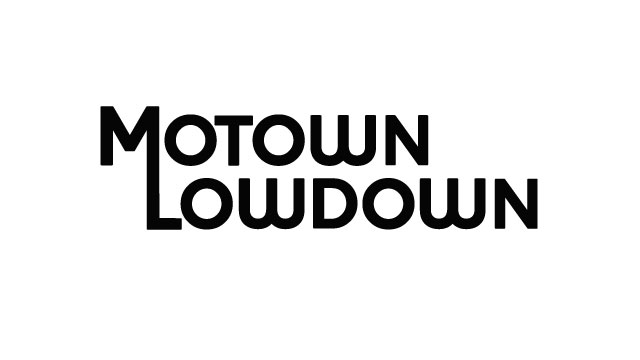
motlow_logo

Designing the logo itself was only a bit more challenging. I wanted to use an icon, but I also wanted to emphasize typography as well. When I wrote the title of my show on paper, I realized that connecting the “M” and the “L” in the title together could form a unified graphic that could be used independently of its full title. The typeface I selected for this logo was Houschka Black, which gave the logo a “modern retro” feel. My professor said the font reminded him of Solid Gold Soul albums, so it definitely struck a cord in a positive way.

The color scheme, on the other hand, was another story. I originally took inspiration from the Motown: The Musical logo and used Rastafarian colors, but when I showed it to my professor, he strongly recommended that I aim for something different. Taking heed of his words, I took my research further and looked into what truly sets Detroit apart from the rest of the crowd: the Big 3 automakers.

motlow_colorscheme


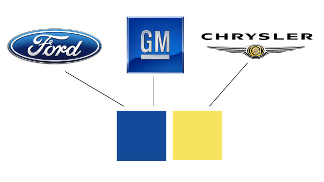
Ford. GM. Chrysler. These companies are the driving force of Detroit’s economy (yes, that pun was entirely deliberate) and the auto industry as a whole would not as prominent without them. From Camaros to Mustangs to the 300, the Big 3 has tremendous influence on our culture. To honor this legacy, I derived my color scheme from the logos of these automakers. I took the two shades of blue from the Ford and GM logos and blended them together into one shade as a subtle, extra touch. The shade of yellow was simply taken from the Chrysler logo. Thus, Motown Lowdown’s color scheme was formed.

Some of the primary graphical elements I used consisted of bars (for transitions and banners) and simplistic vectorized images (specifically for the intro). These graphics were animated using layer masks, which concealed them entirely until the animation allowed them to “form” on the screen. Although the mask animations were brief and simple, their execution was very structured. For one animation, one mask would show the unified initials revealing the full text of the logo; that animation would be put in a new sequence where another mask was formed around the initialed letters that only showed the line formed in the middle before revealing the initials. Each of these sequences would be scaled and moved around horizontally at varying intervals. In the opening, the initialed logo would be animated onto the screen vertically, followed by a mask revealing a long line extending from the lower portion of the  “L” to the right side of the screen; the width of this graphic ended up stretching 5 times the length of the video resolution!

Although the animation of this project proved to be a laborious task, the effort was well worth it as the finalized product went above and beyond my original expectations. My project had six key components to complete:

  • a show intro
  • two bumps (brief clips that play before and after commercial breaks)
  • a lower third (a banner that displays information regarding a news report)
  • a transition (clips that bridged a show clip and a news interview together)
  • a tag (a banner that would display show contact information)
  • a closing (containing all show credits)

The final product can be viewed below in this show reel I’ve assembled:

(Keeping in the spirit of Detroit, I made sure to compliment the montage with a modernized remix of “I Wish” from renowned Motown artist Stevie Wonder.)

Thanks for taking the time to read about this project! It was truly a pleasure to be involved with a concept that I’ve been interested in for so long.
 

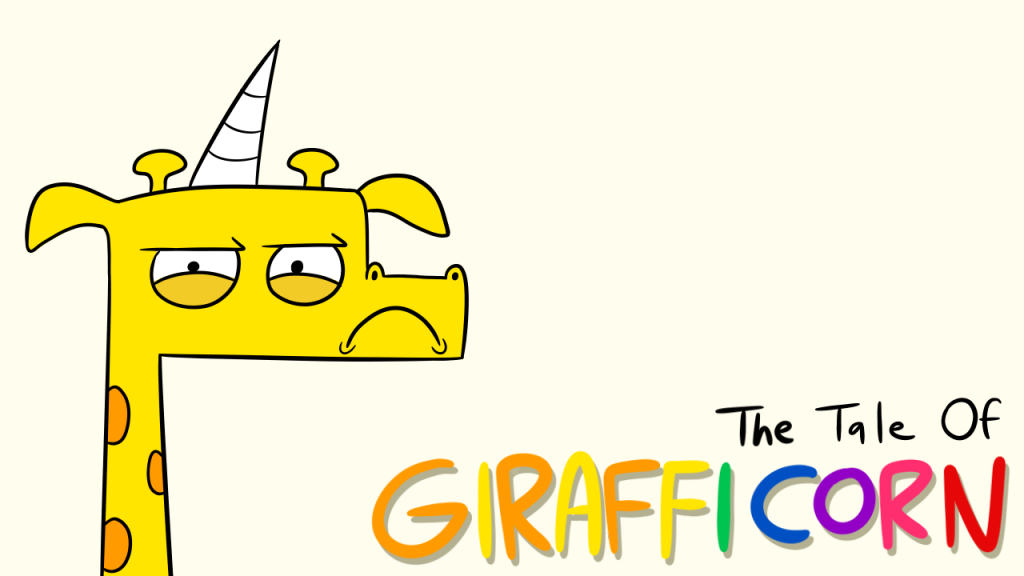
The Tale of Girafficorn

Earlier this month, I was assigned to write a creative fairy tale for my critical reading and writing class. Not only were we supposed to make an original story, but we were also supposed to present it in front of the class with a visual element of our choice. Needless to say, this project had me hooked right off the bat. I already had an idea of what type of protagonists I wanted to use in the story – primarily because I actually created the characters 6 years ago! The wonderful thing about being creative is having the ability to produce several ideas and having them bounce around in the back your head, even if you don’t have the chance to use them all at once. This project not only allowed me to find an outlet for my idea, but it also allowed me to show off my drawing skills in the process!  So without further adieu, I present to you…


Girafficorn_Title

girafficorn_illustration1

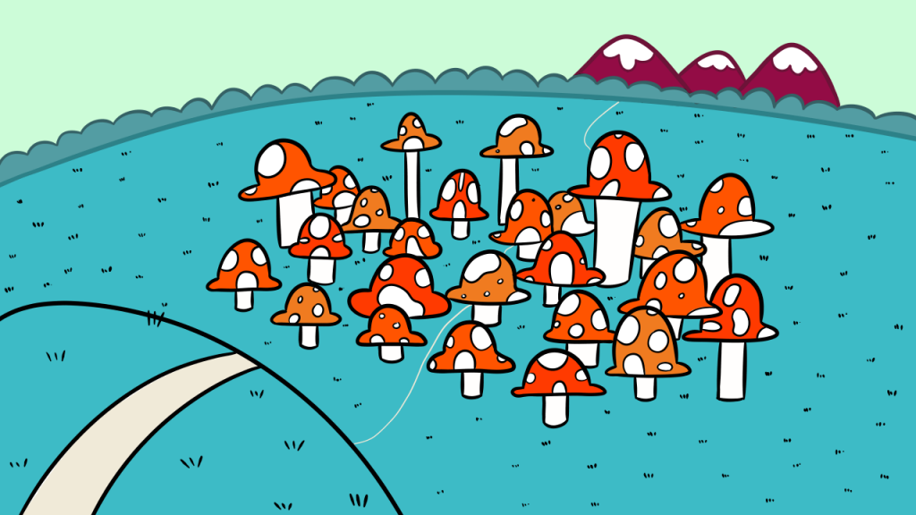
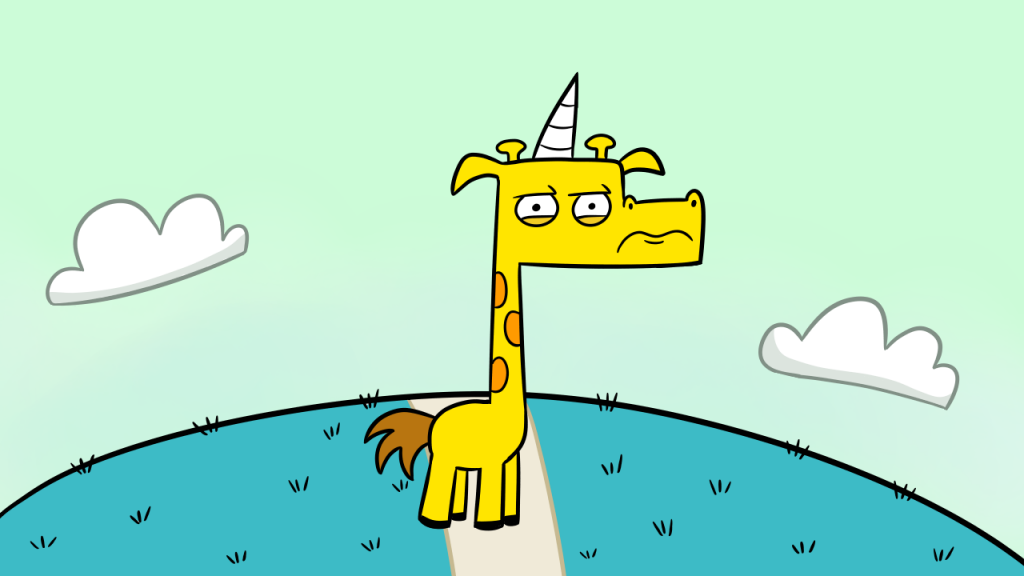
Over the cleanest of creeks and beyond the reddest of peaks, there once was a land known as Bloomingham. Full of open spaces and life-sized fungi, it was a fantastical place in which every living creature could coexist. It was a melting pot full of humans, animals, and magical beings alike. Everyone who lived in Bloomingham lived a very happy and humble life. Everyone that is, except for one.


girafficorn_illustration2

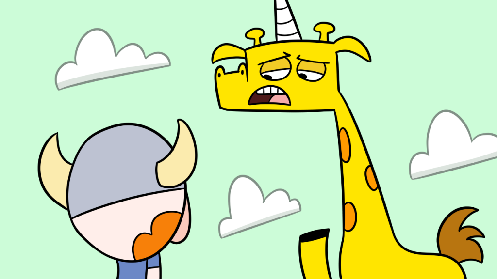
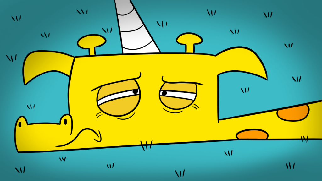
Half giraffe, half unicorn, the Girafficorn was one creature that was a hundred percent grumpy. With a seething scowl on his face, there was nothing in the world that could satisfy him. Was he always like this? Or was he simply born a grumpy Girafficorn? No one in Bloomingham really knew the answer.


girafficorn_illustration3

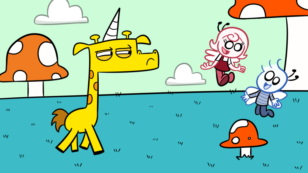
One day as Girafficorn was trudging along, he came across a pair of sprites conversing amongst themselves, gabbing and giggling away. The sight made Girafficorn narrow his eyes in disgust. “Bah!” he sneered, as the sprites gawked at him in bewilderment as he trudged along.


girafficorn_illustration4

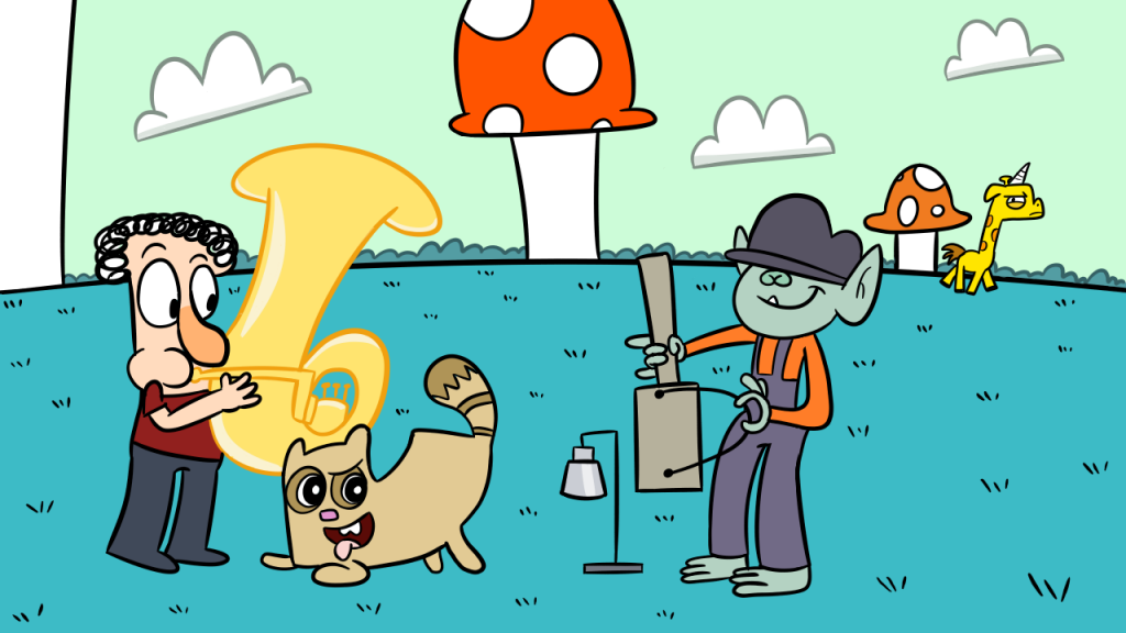
As Girafficorn went on his way, he passed a three-man band that was practicing their chords. The very sound of their instruments made Girafficorn cringe. “Feh”, he grumbled as he moved along without giving a second glance.


girafficorn_illustration5

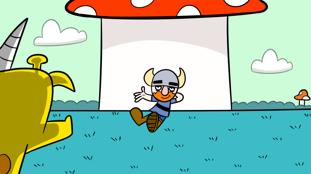
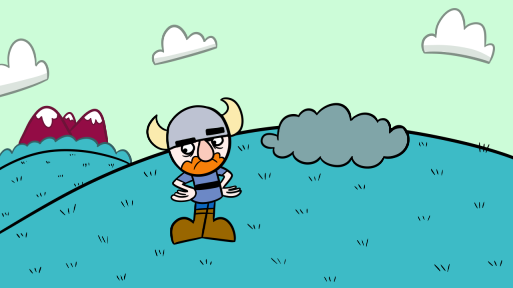
He soon approached a grand portabella mushroom that stood three stories high. Under the mushroom lay Bork, a short statured but simple viking who was cherishing the shade. “Look around you,” greeted Bork as he gestured towards the surrounding environment. “The sun is out, the birds are chirping, and the grass is brimming with vibrancy. Doesn’t it make your heart happy?” Girafficorn clenched his teeth and his horn began to glow. Before Bork could react, Girafficorn shot a blast of energy from his horn, narrowly missing the mushroom and the poor viking.


girafficorn_illustration6

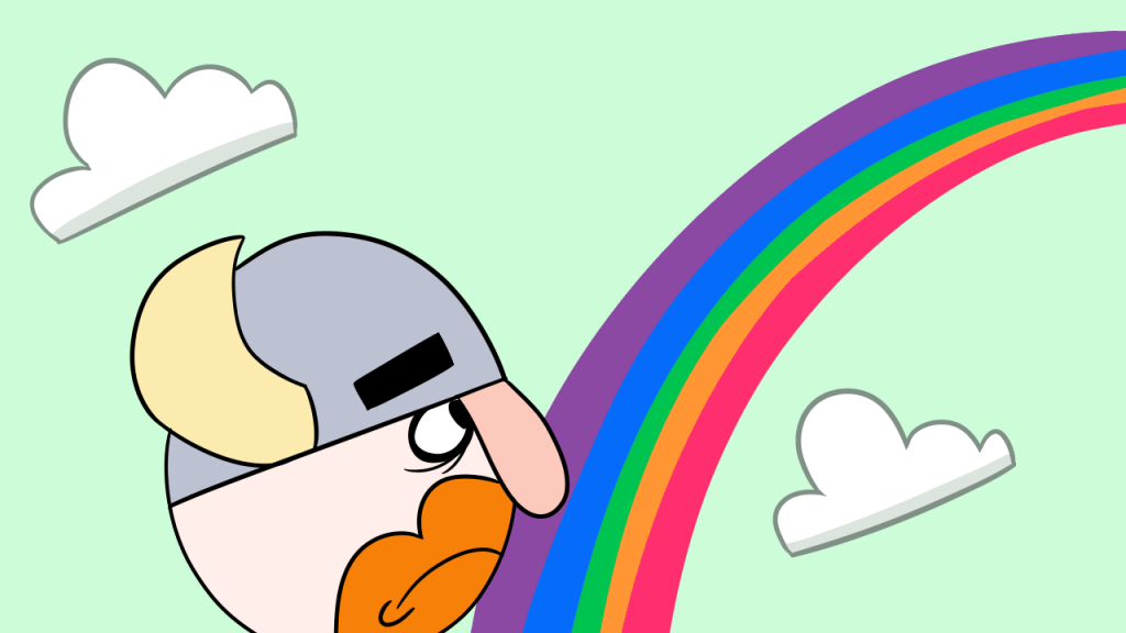
In a fit of rage, Girafficorn flew away from the mushroom and into the distance. Puzzled but determined, Bork followed the rainbow trail in the sky left by Girafficorn to find out what was bothering him.


girafficorn_illustration7

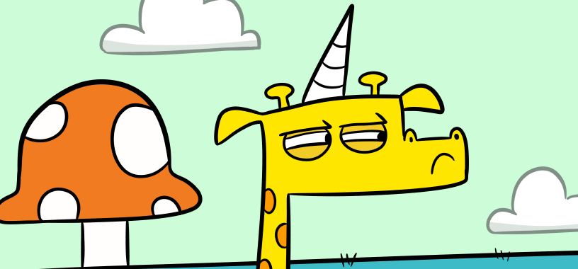
Bork eventually followed the trail all the way to a vacant field on the outskirts of Bloomingham. As he surveyed the area, Bork noticed a shrub and peeked inside to see if Girafficorn was there.


girafficorn_illustration8

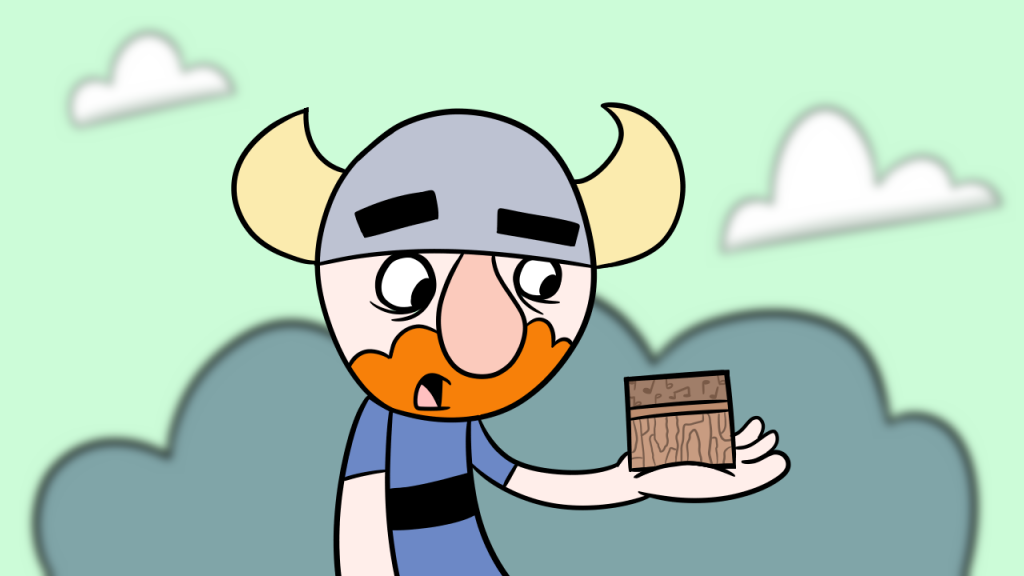
To his surprise, Bork found a small music box made of old birch wood. He picked it up from the ground and opened it, but no music played from inside. All of a sudden, Bork noticed a large shadow tower over him. When he turned around, saw that it was Girafficorn standing from behind!


girafficorn_illustration9

However, something was much different about Girafficorn this time. Instead of being bitter and angry, he appeared to be somber and troubled. “I’m not going to hurt you”, Girafficorn reassured Bork. “That music box was a gift my parents gave me when I was little. Ever since it broke, my life has not been the same without its sweet sound. I would try to fix it myself, but I cannot, for I have hooves instead of hands.” Bork looked thoughtfully at the moping Girafficorn, wishing there was some way he could help.


girafficorn_illustration10

Suddenly, Bork got a wonderful idea. “Stay right where you are!” he told Girafficorn as he dashed away from the field.


girafficorn_illustration11

An entire hour had passed and Girafficorn had fallen fast asleep. He was woken up from his nap by a very faint noise. As Girafficorn gained consciousness, the unknown noise became louder and bolder. Once he had fully woken up, Girafficorn’s face lit up in amazement.


girafficorn_illustration12

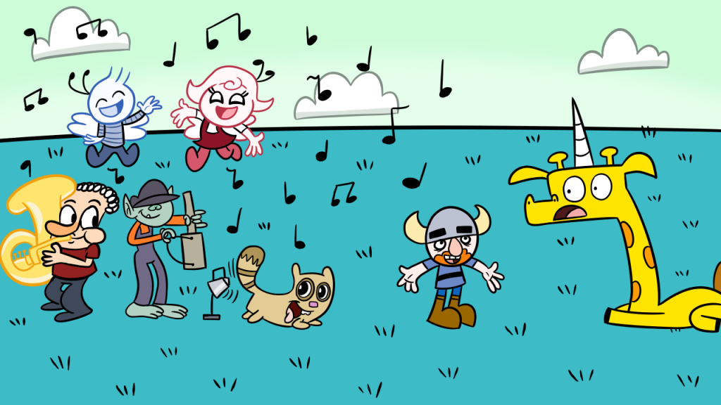
A group of people from Bloomingham had walked over to the field to play music for Girafficorn! With the lovely instrumentation of the band and the harmonious singing of the sprites, it was truly a sound to behold. Bork had caught up with the rest of the crowd and stood in front of Girafficorn. “We may not be able to fix your music box”, he explained, “but we hope we can provide you with something more!”


girafficorn_illustration13

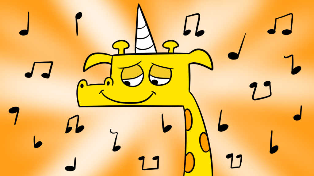
Girafficorn was moved. He had never expected anyone to reach out to him. “This is the nicest thing anyone has ever done for me,” Girafficorn exclaimed as his frown slowly turned into a smile. “Thank you!” And so Girafficorn, Bork, and the rest of the Bloominghamians played and sang and danced well into the late hours of the evening.  Bork’s act of kindness that day had turned the grumpy Girafficorn into a gratified Girafficorn.

I hope you enjoyed my little story! I ended up creating 14 illustrations over the course of 5 days – during what was probably one of the busiest weeks of my semester thus far. I’d say it was well worth the challenge and it payed off in the long run. I’m just glad that I can entertain and inspire people through my artwork. Little things like that keep me going.

(Y’know, if I ever ended up becoming a professional children’s book illustrator…I  wouldn’t mind at all.)

Andy Warhol: The Pop Movement

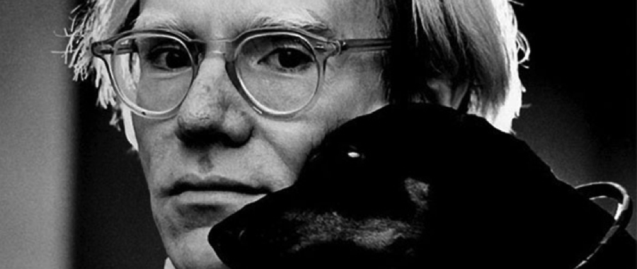
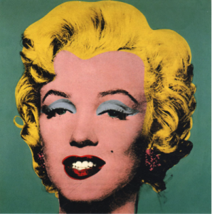
Andy Warhol is one of the influential modern artists of the late 20th century.  It was during the 1960s that one of New York’s most successful fashion artists would go on to create the pop art movement.  This movement began when Warhol started creating large paintings covering a whole plethora of subjects relating to pop culture, from comic books to publicity photographs of movie stars. Although these paintings may have appeared to be bland and unoriginal, Warhol secretly understood that the only way to be noticed by the general public was to create art intended for a less sophisticated audience.

warholmarilyn

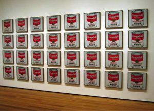
Warhol eventually went on to create imagery based on common objects including dollar bills, soft drink bottles, and more famously, Campbell’s soup cans. The origins of the soup-can painting date back to 1962 when Warhol witnessed the comic strip paintings of artist Roy Lichtenstein at the Leo Castelli Gallery. This would inspire Warhol to buy and trace projections of the canned soup onto a canvas, painting with outlines to mimic the appearance of the labels. Warhol used Campbell’s has the soup brand of choice because a friend suggested not only as a new drawing source, but also because Campbell’s Soup was a highly recognizable brand.

warholcans

He experimented with color for the painting, abandoning the dripping paint effect of his past works and aiming for a more precise mechanical reproduction. Warhol ended up producing thirty-to varieties of the soup cans, which caught the eye of Irving Blum, an art dealer who ended up giving him his own show during the summer. The exhibit would go on to receive mixed reception from the public – while some aspiring artists and filmmakers enjoyed the novelty of the display, other people were either unimpressed or disgusted. It wasn’t until Blum sold five of the paintings that he realized that the paintings were more effective as a work of art collectively. He requested Warhol to buy the paintings for $3,000 dollars.

Despite using their products in his work, Warhol refused to associate himself with Campbell’s as a company. Because the soup labels were not (and remain) copyrighted, he never asked for the company’s permission to use them and the company never sued against his actions. Warhol’s ultimate intention was for people to look beyond the commercial, materialistic exterior of the brand label and admire the paintings solely as a work of art.  Even though his art would be featured in galleries and museums, Warhol remained a commercial artist throughout the rest of his career. It wasn’t until 23 years later in 1985 when Campbell’s approached Warhol again, but this time for a paid request to produce paintings of their dry soup mixes.

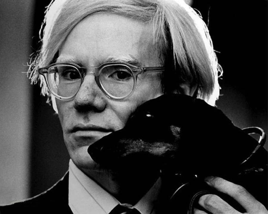
Andy Warhol’s legacy inspires me because it showed me that inspiration for art could come from anywhere and the importance of integrity. Warhol never let the use of Campbell’s label in his paintings prevent them from being poignant from an artistic standpoint. His paintings still captivate and inspire the public to this day.

warhol